Graphic Design
Description:
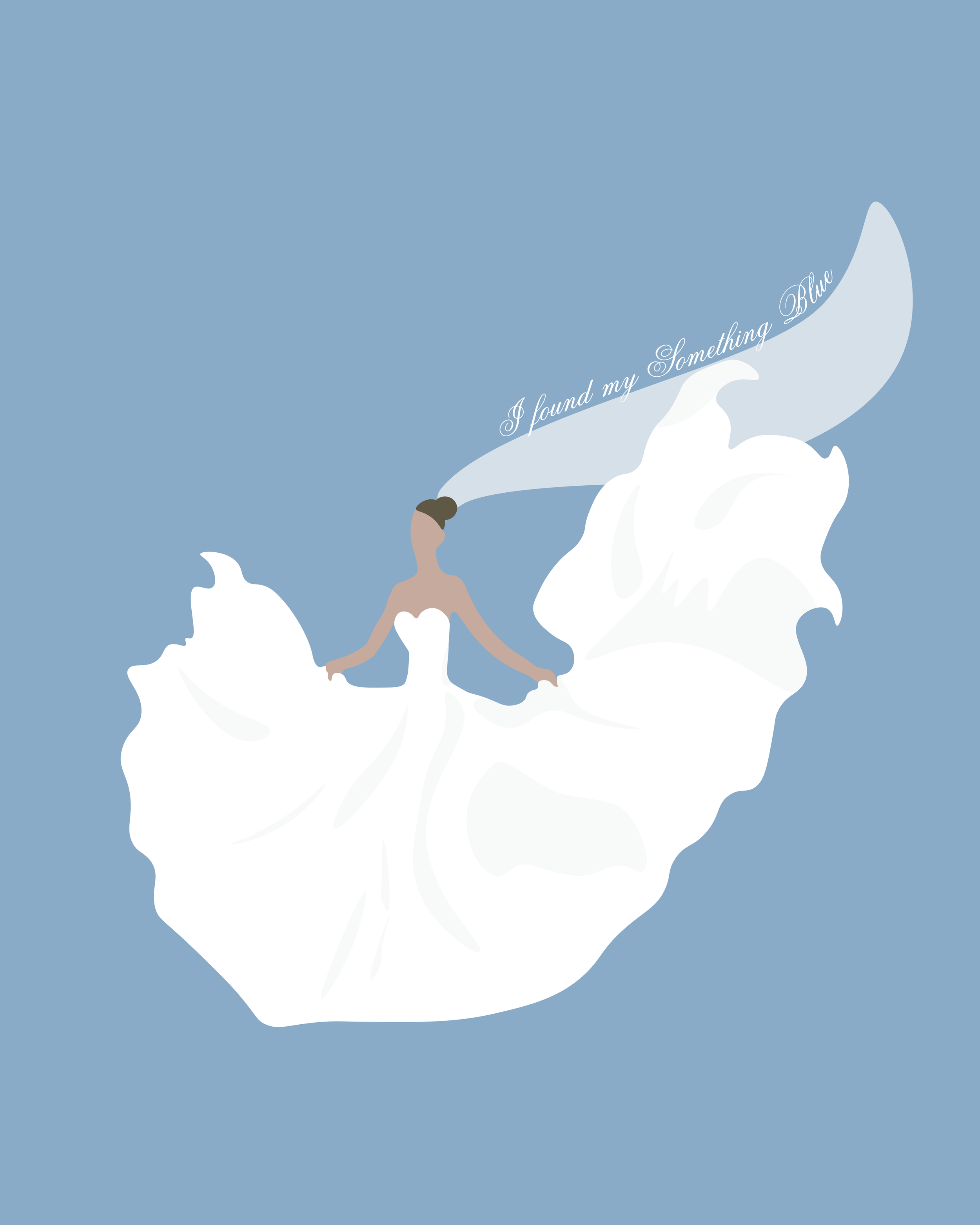
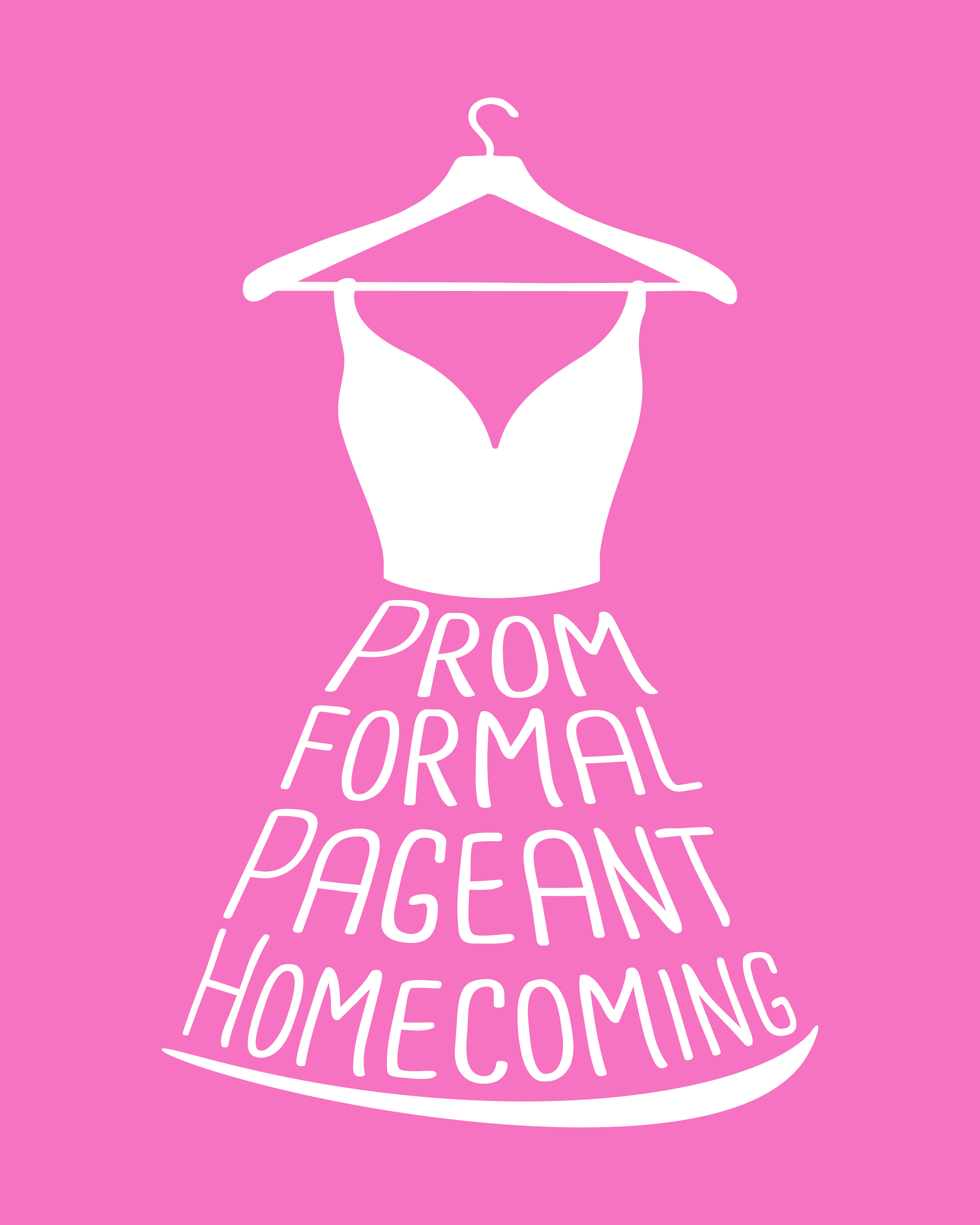
For this client, I created vector illustrations in Adobe Illustrator for the back of promotional T shirts tied to two bridal shop locations. Each design reflects the vibe and purpose of its specific space. The final artwork was prepped for print and used on merchandise.
Designing for actual production was such a fun shift from digital-only work. I had to think about how everything would translate to screen print on fabric, which pushed me to simplify and refine the vector shapes. The gown illustration ended up being one of my favorites, it felt elegant but still fresh.
Description:
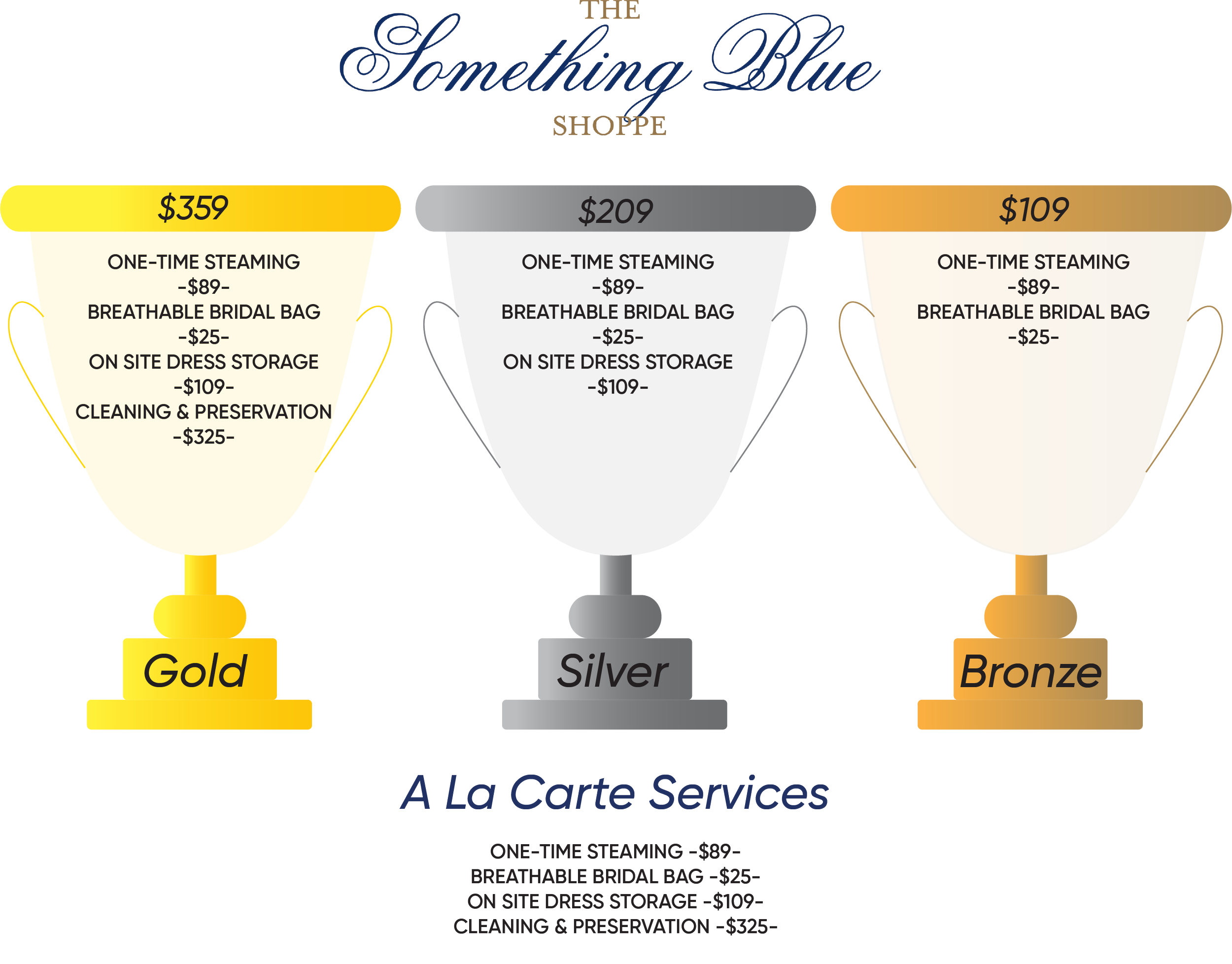
This project focused on creating a clear and appealing visual system for tiered bridal packages. I used illustrated trophy cups to represent the Gold, Silver, and Bronze tiers, paired with pricing and service breakdowns in a clean, spreadsheet style layout. The concept came from the store owner, and I brought it to life from visual direction through final design.
I really enjoyed turning a list of services into something more digestible and on brand. The trophies added a fun visual cue that helped brides quickly understand what each package offered. It was a great reminder of how strong icons and simple infographics can turn everyday information into something more engaging and memorable.
Description:
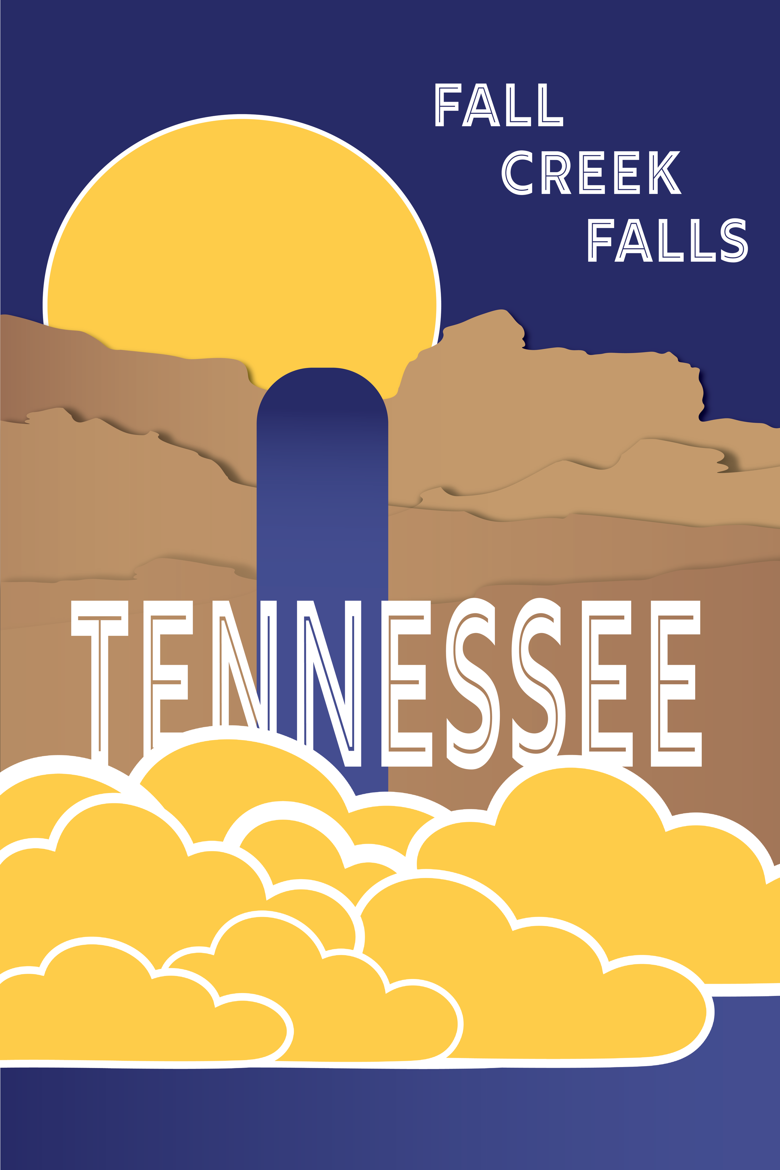
This poster was designed for Fall Creek Falls State Park in Tennessee using a limited color palette and bold typography. The goal was to create a stylized, travel poster inspired look that could work for both print and digital signage.
I loved working with a limited palette because it pushed me to be more intentional and find balance in simplicity. I wanted the waterfall to feel iconic, with the clouds and sun adding structure and rhythm. It ended up being a really good exercise in restraint and visual storytelling.
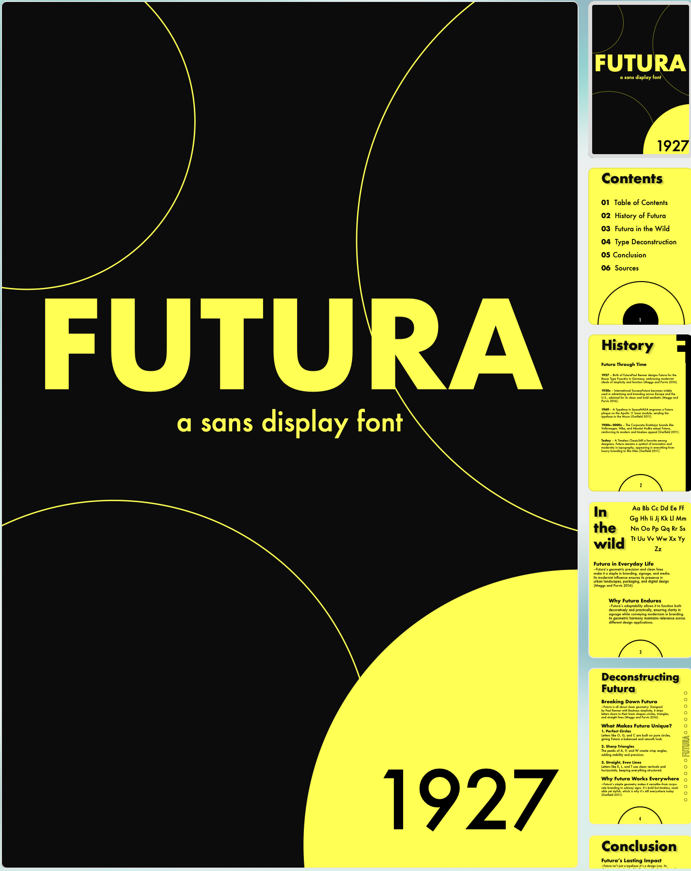
Description:
An experimental layout booklet exploring the history of the sans serif typeface Futura. The project focused on organizing historical facts and visual content into a stylized, high contrast layout using custom grid systems.
This was definitely my playground for pushing layout boundaries. I leaned into that Bauhaus energy and tried to make each page feel bold and rhythmic. It gave me a new appreciation for grid systems and how even historical content can feel dynamic when it is designed well.
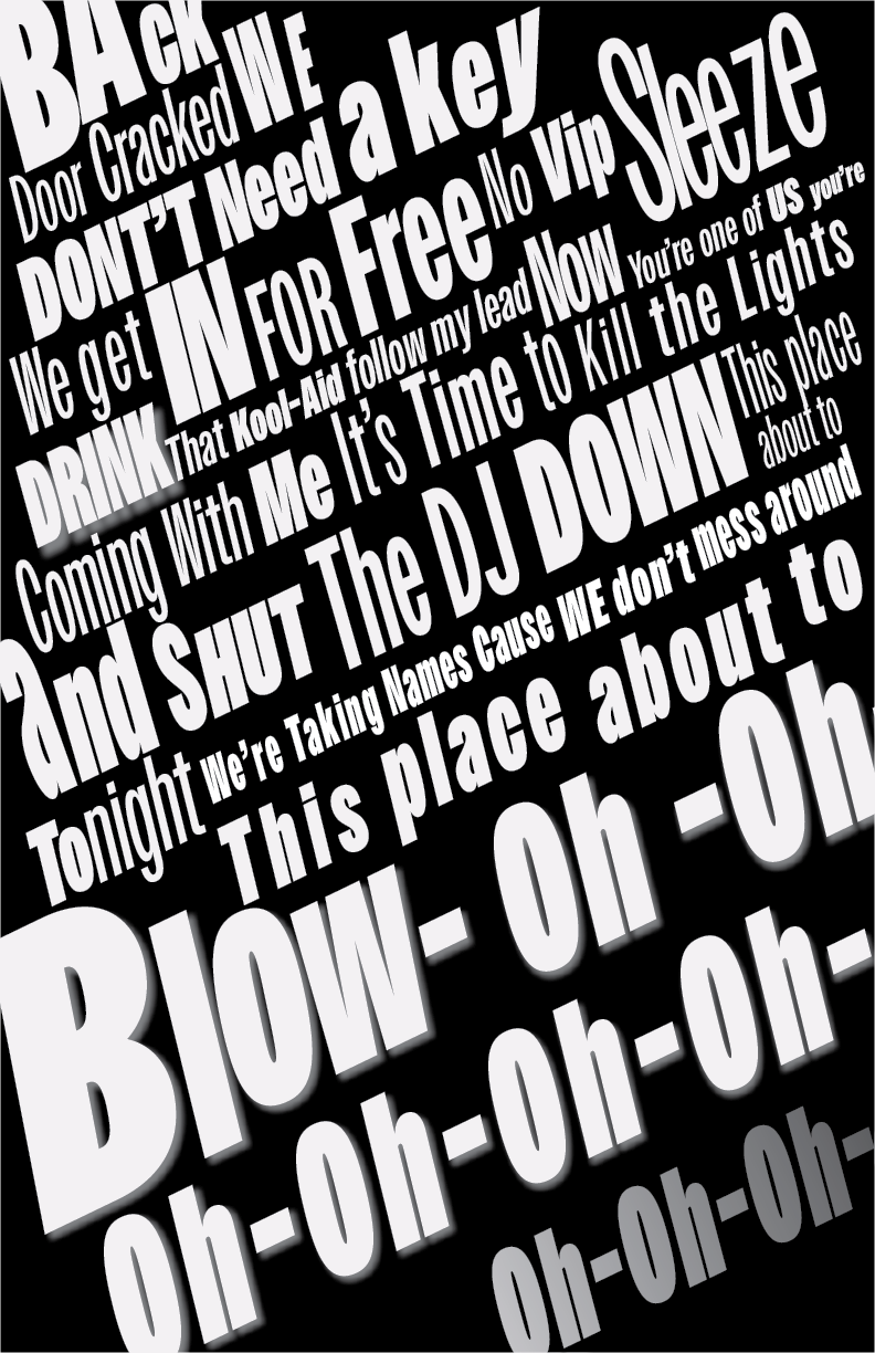
Description:
This is a typographic poster inspired by Blow by Kesha. I focused on translating the song’s energy and attitude into bold, expressive type. I created both a print version and a motion piece in After Effects, using animation to bring out the rhythm and personality of the track.
This was such a fun challenge. I wanted the type to feel loud and a little chaotic, like it was jumping off the page. The motion version let me lean into that even more and play with timing in a way that matched the song’s vibe. It pushed me to loosen up and try something more experimental, which ended up being my favorite part.

Description: For this project, I created a concept poster series for Tate McRae’s concert tour. I wanted to explore what her tour visuals could look like, using custom type, layered imagery, and bold color to match the mood of her music. I designed a set of three posters that feel cohesive together and showed them in PSD mockups to give them a more real world feel. I also put together a process book that walks through my layout choices, composition, and overall direction.
I’m a fan of Tate McRae, so this one felt really natural to get into. I wanted each poster to feel a little emotional and a little dramatic, still clean but with movement. It was fun getting to think like a creative director and build out a full tour look from scratch. The process book was honestly one of my favorite parts because I got to slow down and really look at how my ideas changed as I went.
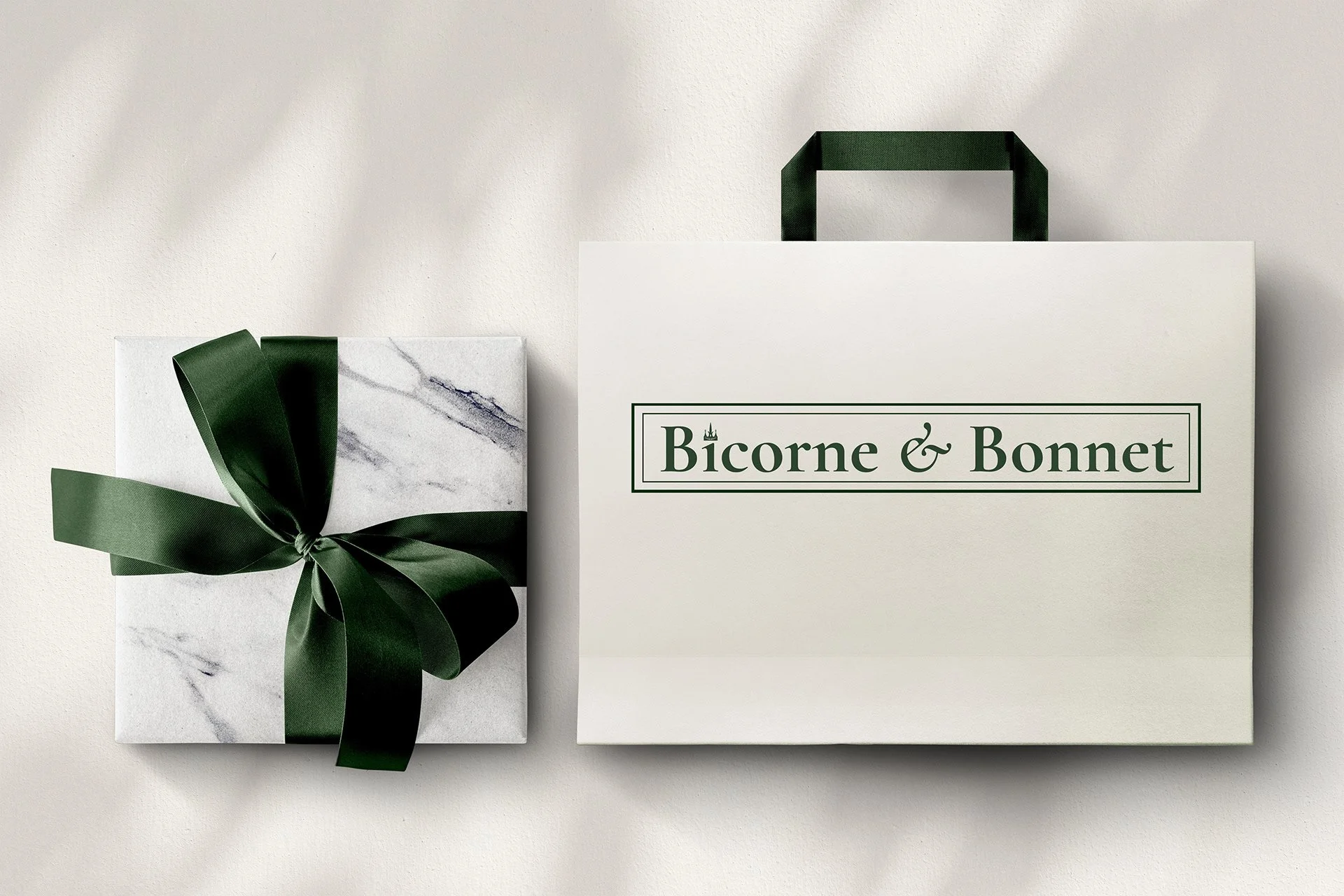
Description:
I created branding for a fictional UK based luxury hat shop, including logo design, packaging mockups, and a conceptual Instagram feed. I used PSD mockups and custom visuals in Photoshop to build out a brand that feels elevated but still approachable.
This one was such a fun mix of branding and storytelling. I wanted the packaging to feel high end without coming off too cold, and the dark green ribbon with the marble texture really helped bring that warmth in. The Instagram concept was honestly one of my favorite parts. I got to think through how the brand would show up day to day and what its voice would feel like.
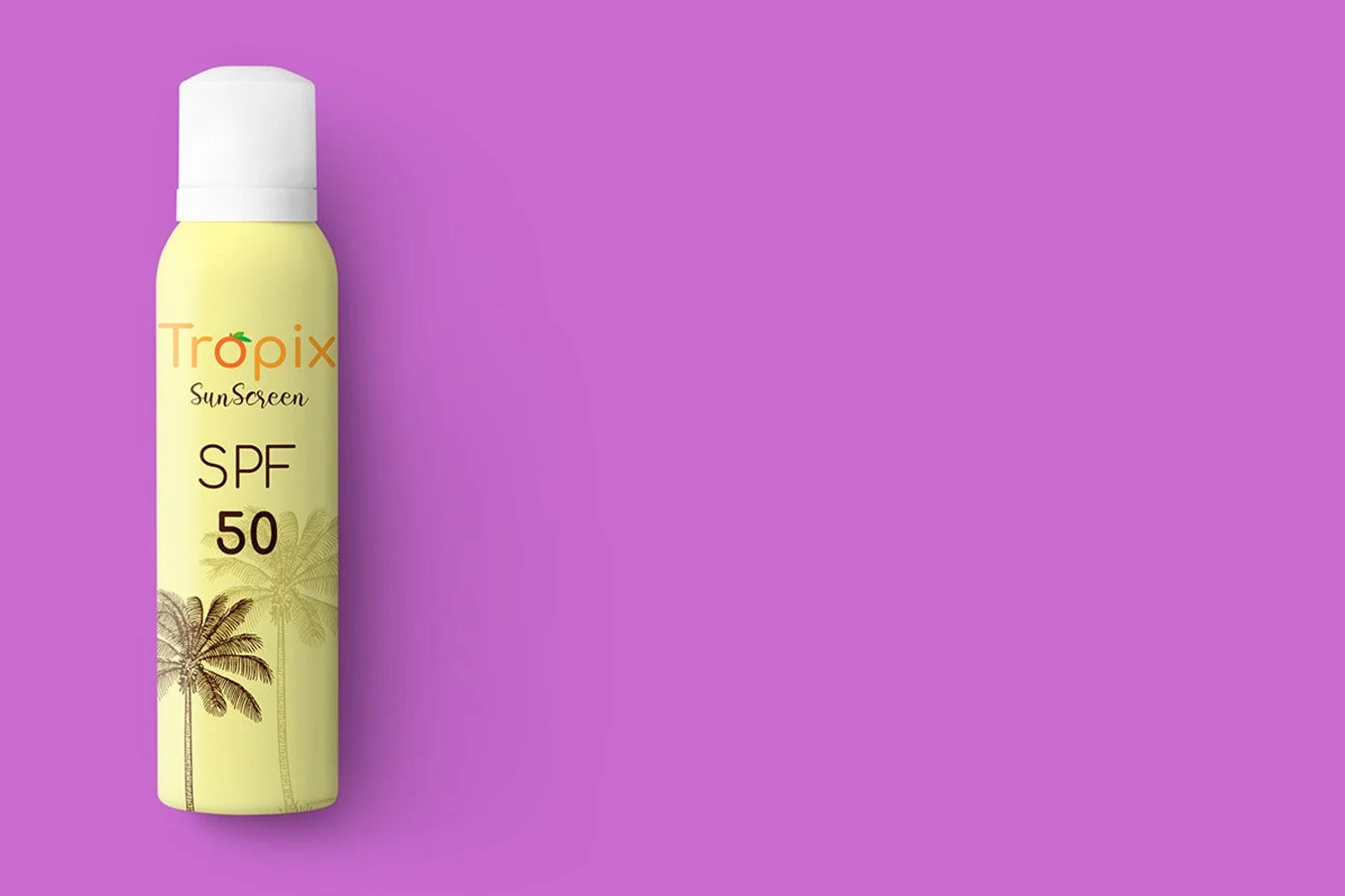

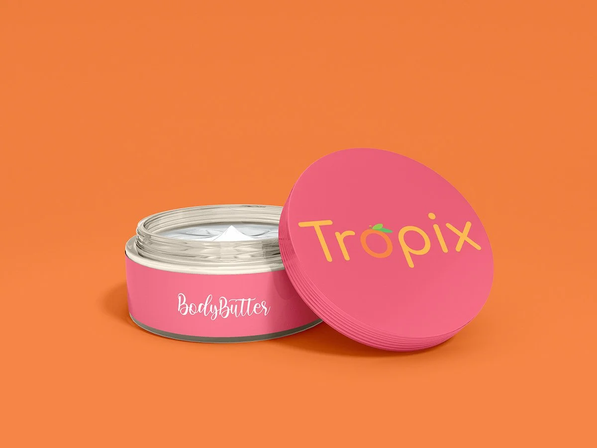
Description:
I was asked to develop a demo logo and mockups for three cosmetic products for the fictional brand Tropix. Using Photoshop, I applied the logo across sunscreen, body butter, and skincare jar mockups to bring the brand to life with vibrant color and clean type. It pushed me to think through brand identity and how everything would translate across different products.
I wanted the brand to feel summery, playful, and easy to recognize. I leaned into bold color to give it a modern, tropical feel. This project really helped me get more consistent across packaging and more confident using mockups in a way that still feels polished but fun.